Archive for the ‘The Kitchen’ Category

h1

Floored!

February 10, 2011

For a while now, actually, but I’m doing an extraordinarily bad job of keeping this blog updated…so I’ll play catch-up with some kitchen photos as we inch closer to finally wrapping this thing up! Here’s what we accomplished in December (along with some other fun but less photogenic things like electrical and plumbing work).

This is our shiny new Marmoleum Click tile from Anderson Carpet & Linoleum on Broadway, installed in December by D. (with a little bit of help from me!) The Labradane is a fan, or at least he became one once he got used to slip-sliding on it! He’s perfected the art of stopping mid-kitchen and sliding the rest of the way to the back door—but remarkably, two months later this stuff has yet to show many scratches to speak of. So that gets it a thumbs up from me!

Next up: What we did in January

h1

Yep, we’re still here…

November 12, 2010

…though our kitchen isn’t!

I have had absolutely zero time to write anything (or even think about writing anything!) this fall, with a bad combination of kitchen craziness kicking off just as things at work suddenly ramped up quickly. And while I had every intention of carefully documenting our kitchen remodel, I discovered on the morning of demo that we didn’t even have a working camera in the house—aaah! I am still trying to carve out some time to post more regularly, but right now that looks iffy through the end of the year. Fingers crossed for things calming down a bit in 2011!

However, I did find a working camera, and will be better documenting it moving forward and writing some small bits on our kitchen as we finish chunks (but not in the midst of the work, out of respect for the many contractors who are hard at work on our kitchen). We’re also having lots of tasty meals out (and at our friends’ and neighbors’ places–thanks guys!) so with luck there will be a few more restaurant reviews coming soon, too.

So, for now, I leave you with some terrible iPhone before and during photos of our kitchen. We had the crew from the Reuse People in East Oakland come out to deconstruct our kitchen, so they saved what they could and took it off to to be, hopefully, reused.

Here’s one of the last “before” shots, just before the demo crew arrived…

See ya, Wall o' Cabinets!

See ya, Wall o' Cabinets!

…and here’s what it looked like when they finished pulling off the cabinets and the old stove flue. Yeah, who needs walls when you’ve got some plaster and putty to stick things on!

Goodbye, flue!
Goodbye, flue!

This is the old laundry porch, which had been integrated into the breakfast room in the 1940s. Turns out the wall  behind the cabinets had never been plastered—it still had the original beadboard, and in that remodel they just covered it up with our breakfast room built-in sideboard. We haven’t decided whether to take the beadboard off and plaster it or just leave it along (though leaving it be is complicated by the fact that the old plumbing hookups stick out of it, and still need to be removed). The old laundry sink vent was, happily, our only demo surprise—it wasn’t connected to anything, so it just got sawed off and hauled away.

Beadboard!

Beadboard!

We discovered this little drawing behind the built-in. Someone had apparently been sketching out the plan before they started!

'kay, build me this please...
‘kay, build me this please…

…and here’s what the built-in actually looked like. Came pretty close! (Though I actually like the drawing layout a bit better…)

Breakfast room built-in circa 2008

Breakfast room built-in baking area

Because we didn’t do the demo ourselves, we probably missed out on some other fun historical finds (and D. was bummed to discover, a week later when we finally took a look at the roof, that the demo crew accidentally trashed the antique chimney cap for the stove flue, which we’d asked to keep. *sigh*) We did find snippets of a newspaper; the Penney’s ad had no date, but probably was from the 1939 remodel based on other examples we could find online with similar styles and prices.

With any luck, we’ll do the rough inspections next week, and then it’s on to plastering and a weeklong painting-and-flooring marathon so that the cabinets can go in the week after Thanksgiving. And that’s the news for now…

h1

Kitchen Chronicles: Bungalow layout inspiration

July 16, 2010

One of the fun things about living in a 1915 bungalow is finding other similar homes and looking at what others have done with the layout over the years—and boy, are there a lot of them! As we started thinking about the kitchen two years ago, one of the most interesting things I did was to start browsing the MLS listings to take a look at other bungalow kitchens. In Oakland, it’s surprisingly easy to find them, too. While our house isn’t a kit house (that we know of) and we have yet to find a twin other than its actual next-door twin, there are still a lot of strikingly similar variations on the layout. If I set search parameters to include houses between 1000 and 1500 square feet that were built between 1900 and 1930, it’s a pretty good bet that I’ll turn up at least one or two similar kitchens on any given day. And if I only look at the two-bedroom houses built between 1914 and 1925, my odds quadruple.

The telltale signs of a similar layout are the door placement (right up against the wall on one side, sometimes still a swinging door) and the double windows over the sink. For most houses of our variety, the dining room is just outside the kitchen on one side, and the backyard or a porch on the other. Occasionally, I’ll see a house that still has a separate breakfast room and back porch, often converted into laundry rooms or half baths. (Our house had these rooms until a 1939 remodel modified the wall.)

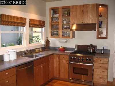
Here are a few kitchens I’ve found over the years and saved for layout notes. (A few disclaimers: these photos are all from EBRDI and copyrighted accordingly. Also, these are all from the ‘hood, so it’s entirely possible that the people who now live in these houses might stumble on this blog; if one of them is your kitchen and you want the photo removed, just let me know and I’ll gladly take it off. Alternatively, if one of these is your kitchen or very similar to yours and you want to share anything about the layout, please do! Finally, many of these listings were originally accompanied by websites with floor plans, so in some cases I know the layout is similar not from the photo, but from looking at a floor plan or even dropping by the open houses.)

First, here’s our kitchen’s MLS photo, for context:

Look how clean it is!

Our kitchen, prettied up and staged for sale. Look how clean it is!

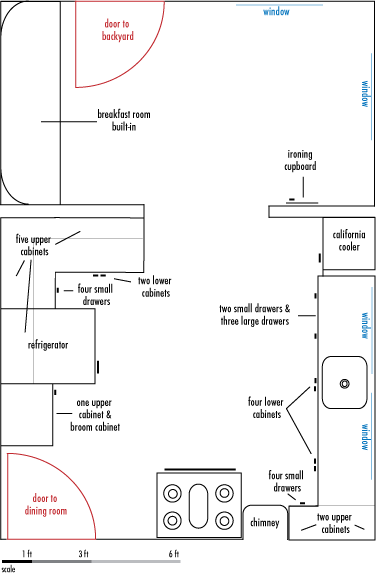
Here’s what our blueprint originally looked like:

1915 blueprints of our kitchen (flipped from our neighbor's copy)

1915 blueprints of our kitchen (flipped from our neighbor's copy)

And here’s what some other folks have done with roughly our layout. Interestingly, almost all of these kitchens also break the work triangle, with the exception of a few that either never had or have removed their coolers and have the refrigerator located there.

This kitchen sacrifices corner counter for a longer run to the right of the stove.

This kitchen sacrifices corner counter for a longer run to the right of the stove.

This was helpful to get a sense of what counters on the right side might look like. It also convinced me that we don't want our refrigerator where this one is, since it creates too much of a wall as you come into the kitchen.

This was helpful to get a sense of what counters on the right side might look like. It also convinced me that we don't want our refrigerator where this one is, since it creates too much of a wall as you come into the kitchen.

This is roughly what our corner will look like, except we may have shelves instead of an upper there, and our drawer banks will be a bit bigger.

This is roughly what our corner will look like, except we may have shelves instead of an upper there, and our drawer banks will be a bit bigger.

This is the same kitchen, but gives a glimpse of the breakfast nook. This is my model for ours.

This is the same kitchen, but gives a glimpse of the breakfast nook. This is one model I like for ours, though our kitchen is a bit longer than theirs, so it would be a roomier layout.

Another approach to the fridge dilemma. We could do this, but I don't like the resulting counter space configuration much.

Another approach to the fridge dilemma. We could do this, but I don't like the resulting counter space configuration much. They also seem to have a peninsula to make a "U" shape, something a couple of the designers we talked with suggested for our space.

This is one of my favorite kitchens. You can't tell in this photo, but the door is just to your right, and there's actually a cut-through to the dining room over the counter on the right. We would need to sacrifice the cooler to get a U like this, though.

This is one of my favorite kitchens, though it's not quite the same as ours (but quite similar if you look at the full layout). You can't tell in this photo, but the door is just to your right, and there's actually a cut-through to the dining room over the counter on the right. We would need to sacrifice the cooler to get a U like this, though.

Yet another approach to the corner. Not sure where the fridge is in this kitchen, as the photos don't include it.

Yet another approach to the corner. Not sure where the fridge is in this kitchen, as the photos don't include it.

This kitchen pushes the chimney into the corner, which is pretty common. They also wrapped around a peninsula, and seem to still have their cooler, too.

This kitchen pushes the chimney into the corner, which is pretty common (and much smarter than ours, where it's dropped into the center of the room!) They also wrapped around a peninsula, and seem to still have their cooler, too. This kitchen is either a wee bit wider than ours or laid out differently as far as the doors go, since we can't quite get a peninsula in while keeping a 42" aisle against the wall. Ah, well.

h1

Kitchen Chronicles: The plan!

July 12, 2010

Bet you thought we’d abandoned this project, huh. It does feel a little like that, since I’ve had to redirect energy to several other big projects this spring….but we’re still hoping for a summer start on our renovation. My original goal was to be in our new kitchen in time for our third anniversary of being in the house in September (which is now looking a little on the optimistic side, but hey). We do finally have a close-to-final plan, though. This has been through a lot of iterations, and as we started to get bids on the structural work, we realized we’d bitten off a little more than we could chew with our original visions of pocket doors and grand entrances. So instead, we wound up with Kitchen 2.0, the new-and-improved version of what we already have.

As a reminder, here’s our current kitchen (but imagine it upside down):

Our kitchen

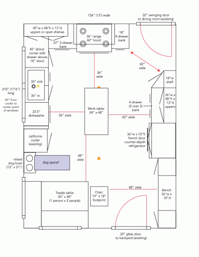
And here’s our new plan. Update: Here’s a diagram that includes the hypothetical furniture, too (not to mention a few tweaks, since this is a work in progress).

Kitchen with furniture!

It’s not so different, but it fixes a lot of the critical flaws. It also creates a few new ones, namely breaking the work triangle rule by placing appliances a little too far apart and across a major corridor. We haven’t figured out a good way to avoid this, though, short of some serious structural work that would blow our pretty modest budget. The vast empty space will house some sort of breakfast table, plus a little bench and space for shoes, coats, and dog-related paraphernalia. I’m also still fiddling with the refrigerator wall to try to consolidate that cabinetry without completely blocking the view from the doorway to the backyard…we’ll see.

Anyway, the next step is to refine the plan a bit more as we try to pick out cabinets that will respect the style of the house and also respect our meager post-wedding bank account…we’re inching closer, but still not quite there yet!

h1

Kitchen Chronicles: A little Oaktown history!

February 26, 2010

Yeah, I know it’s been weeks since I’ve had anything to say about our kitchen remodel. This isn’t because it’s fallen to the wayside—in fact, it’s chugging along nicely, on track for a post-wedding July start—but because I’ve had absolutely no time to sit down and write much of anything. Soon, though! In the meantime, here’s a little fun history I ran into along the way.

If you’ve ever worked on a kitchen remodel, you’ve probably encountered the kitchen work triangle—the magic space that is supposed to connect the areas for preparation (sink), cooking (stove), and storage (refrigerator). What you probably didn’t know, though, is that this simple-but-revolutionary theory was pioneered by (among others) Lillian Moller Gilbreth, the first female industrial psychologist, one of the first women to earn a Ph.D. at Berkeley (although for complicated reasons, she never received her degree), and a native Oaklander. That’s right—the work triangle theory has its origins in our city, and even—amazingly!—on our very street, where Lillian grew up over a century ago. (Back in those days, our house was still just a twinkle in Edward Brown Walsworth’s eye; the Presbyterian minister from Cleveland ran the Female College of the Pacific on what is now Pill Hill, and owned the tract of land that would ultimately be subdivided to create our neighborhood. Our stretch of Harrison Street north of 27th/Bay was called Walsworth Avenue in his honor up until the 1930s, when it was finally renamed to create more consistency in the street grid.)

So what’s a work triangle?
The basic tenets of the work triangle theory are:

  • Each leg of the triangle should be between 4 and 9 feet
  • The total of all three legs should be between 12 and 26 feet
  • No obstructions should block a leg of the work triangle
  • Household traffic should not flow through the work triangle
What your work triangle is supposed to look like...

What your work triangle is supposed to look like

If you can get all of that accomplished, you’ll have a more efficient kitchen. It should be noted, of course, that all of these dimensions were refined back in the 1930s and 1940s, when kitchens were a whole lot smaller and it was pretty simple to accomplish this. (In fact, our current kitchen meets all but the last work triangle requirement!) Back then, the concept of maximizing efficiency in the workplace was pretty novel—before the late nineteenth century, designers hadn’t thought about this as scientifically. Enter consumer science and industrial psychology!

The "Kitchen Practical"

The "Kitchen Practical"

And who’s Lillian Moller Gilbreth?
Lillian Gilbreth is probably best known these days as the matriarch of the Gilbreth family, whose adventures were chronicled in the books (and later two rounds of movies) Cheaper by the Dozen and Belles on Their Toes. But while her husband Frank’s work in scientific management and efficiency studies was groundbreaking, Lillian’s work on motion studies, time management, fatigue, and stress—and especially, on work issues affecting women—was equally critical to the development of modern domestic science and ergonomics.

Lillian Moller Gilbreth

Lillian Moller Gilbreth

Lillian was born Lillie Evelyn Moller, and grew up on our street a few blocks west in a house that was sadly torn down in the 1940s to build part of what is now the Summit Medical Center campus. (She changed her name to the more formal “Lillian” later in life.) At the time, “Academy Hill,” as Pill Hill was originally known, was prime real estate in Oakland, with a number of sizable mansions in the area. The Mollers lived in a large home there with two Japanese servants.

Lillie’s father, William Moller, was a partner of Robert Dalziel (another name that should be familiar to anyone who’s spent time at City Center!), and their plumbing and gas fixture empire, the Dalziel-Moller Company, was one of the largest wholesale plumbing dealers in Oakland and San Francisco in its heyday. (It later became Dalziel Plumbing Supply and ultimately closed in the 1980s.)

Her maternal grandfather, Frederick William Delger, was considered Oakland’s first millionaire, and owned a huge estate bounded by Telegraph, Broadway, 17th, and 20th on the land that is now the Uptown apartments. Much of the estate was dedicated to renowned gardens that filled entire blocks. (The Delger family also built the building that now houses Smart & Final in Old Oakland.) Delger initially made his name as a shoe salesman with stores across the Bay Area to serve the Gold Rush miners, but strategic investments in downtown Oakland and San Francisco secured his fortune. The Delgers were also key supporters of Fabiola Hospital, which later became Kaiser Permanente’s first home, and the Altenheim, which was initially founded in the Dimond as a senior home for German immigrants. (Thanks to significant reinvestment in 2007, the Altenheim is still providing affordable senior housing for older Oaklanders and is now also on the National Register of Historic Places.)

During the time Delger lived in Uptown, he named the streets on his land Frederick Street (now 19th), William Street (still there!), and Delger Street (20th). Gotta love creativity. (If you’ve ever wondered why many of the numbered streets in downtown Oakland are only in a kinda-sorta grid, it’s because the numbering was done after the fact; in the city’s earliest stages of development, many of the streets were named for and platted by the landowners, but in later years as the city grew, a numbering system was superimposed. In contrast, the numbered avenues in East Oakland were planned before much of that development went in.) Delger and his family are now buried in an ornate mausoleum in Mountain View Cemetery at the end of Piedmont.

The Delger mansion on 19th Street (from the Oakland Museum)

The Delger mansion on 19th Street (from the Oakland Museum)

Lillie, the oldest of the Moller children (excepting an older sister who died as an infant), was first home-schooled, and briefly attended Miss Snell’s Female Seminary before transferring to public elementary school in Oakland. (I haven’t been able to figure out which one; the only clue is that after the Moller family moved away from Pill Hill, Lillie had to take the streetcar to school. But since I’m not sure where they moved to and many of the streetcar lines converged on Broadway at that point, that doesn’t help much!) From there, she attended Oakland High School—Oakland Tech had not yet opened—and overlapped for a year there with author Jack London. Finally, following graduation, she went on to UC Berkeley, becoming one of the first women to pursue graduate education there.

While Lillian’s Oakland story ends there—she moved out east, married Frank Gilbreth, and settled there, only returning to California for visits after that point—she went on to do all sorts of work, pioneering the new field of industrial engineering and helping to lay the groundwork for modern industrial engineering. But that’s a story for another day!

Anyway, none of this has helped advance our kitchen project much, but it’s been fun to wade through some of the history on this. If I get a chance (that would be this summer at the earliest!) I’ll pull it together into something a bit more comprehensive with some better pictures. Still, it’s a cool little window into our neighborhood’s past.

h1

Kitchen Chronicles: Color inspirations

December 29, 2009

Initially, color seemed like one of those fun details that we could save till the end of the kitchen renovation process and have a little fun with. As it turns out, it’s a decision we need to make fairly early on in the process, since the color of the cabinets will drive a lot of design and cost decisions. (Specifically, we need to decide whether we’re doing painted cabinets or natural wood, since that in turn affects flooring choices and both affect the bottom line.) So I dug up several art pieces I’d been saving for a while and had them matted and framed over at Kuhl Frames + Art in Uptown. (Miraculously, I also got through the whole framing process without having to buy D. the Devo poster he’s been eyeing that’s part of the Lil Tuffy poster exhibit the shop is hosting right now! Yes, that would be the only poster in the whole show that costs more than all of our new appliances put together will…)

The first two pieces are old fruit labels that my aunt and uncle gave me years ago; I’ve been toting them around ever since (note the nice crease down the snow owl one!) I think they’ve been in no fewer than seven different apartments in five cities over the last decade—augh! So it’s long time they were framed. It’s hard to see, but the frames are actually a very deep brown with a light cream mat.

Fruit labels

The third piece is by Olympia-based artist Nikki McClure, who does crazy beautiful paper cuts. (I got this one at Issues off of Piedmont Avenue, where they usually have a nice assortment of her work.) Seriously, I’d wallpaper our house with these if D. didn’t have a say in it! (But he does, so we also have some old school Shepard Fairey from back when he was still counterculture. And also, cute photos of elephants with little children.)

Nikki McClure print

So obviously our kitchen is not going to be striped in red and black, but I do want a color scheme that this art can accent. We’re leaning strongly towards painted cabinets right now, and D. is adamant about not wanting a white kitchen, which is the more traditional “look” for an Arts and Crafts house. So instead, we’re exploring lighter creams, grays, or greens—plus a few natural woods—for the Shaker-style cabinets, probably with a wood floor and dark countertops. That actually gives me a nice palette to work with, since we can potentially keep the walls in the sage family, which makes the red and cream a perfect complementary color. Or we can use some yellows, which could look really nice with gray cabinets and red accents. I like the look of the green cabinets too (D.’s favorite is a color called “silver sage”) but it just seems like the kind of thing that we could get tired of in the years to come, and then we’re pretty locked into the color. Bleh.

Anyway, for now, I’m stalking Sunset, Apartment Therapy, Design Pad, and the many house blogs out there for some inspiration and ideas. Know anyone with good green, gray, or cream kitchen cabinets to look at?

h1

Kitchen Chronicles: The (not so) bad beginning

December 17, 2009

Yep, it’s that pesky kitchen again…

In the last episode, we discovered that there were far too many complicated and expensive things that needed to be fixed with our circa-1939 kitchen (with a 2007 “facelift”) for it to make much sense to do the project piecemeal. Instead, we started saving up for one big overhaul. We’re not quite there yet, but I’ve decided to go ahead and start working on the plan and talking to contractors so that we can get this thing rolling in the new year. Not exactly a bad beginning, per se, but certainly a far more expensive (and stressful!) one than we’d originally envisioned.

First things first: to save those of you who really don’t care about our kitchen from having to wade through what will probably be a LOT of posts about the renovation process in the coming year, I’m going to start titling and tagging any kitchen-related posts as “kitchen chronicles.” Read ’em if you like kitchens, or ignore ’em if you don’t.

Crafting the plan
One of the first things I did once we decided to tackle the entire space was to sit down and make a list of the current problems and the multiple roles we’d like the space to serve. Here’s how we envision it:

  • More light!
  • Better flow from the dining room into the kitchen into the breakfast room and out into the yard
  • Preserve the breakfast room function, if not the physical division of space
  • Allow the breakfast room to double as a mud room (which it sort of does now, but not terribly well)
  • Create space for the dog’s bowl and supplies
  • Create a continuous work surface somewhere in the kitchen itself
  • Eliminate the “wall” of cabinets that you walk into when you enter the kitchen from the dining room
  • Preserve the California cooler, the only original element in the kitchen
  • Preserve the ability to close the kitchen off from the rest of the house
  • Create a kitchen that fits into the historical aesthetic of the house

That’s a lot of different pieces and different jobs for a relatively small (13 feet by 17.5 feet, counting the breakfast room) space to fill. We’re still playing around with different configurations to get there, but right now, the plan is looking something like this:

Here’s what we’re starting with, as a refresher:

And here’s what we really started with, courtesy of our neighbor. This kitchen is actually  from the blueprints of our house’s mirror-image twin. I flipped it in Photoshop, but that would be why “screen” and “glass” are still backwards. (Or rather, I’m lazy and that’s why they are.) But you get the idea, and you can still see where the original walls and counters were, which is pretty crazy! In our house, the wall between the porch and the breakfast room was taken down as part of the 1939 remodel and the ironing board was moved.

1915 blueprints of our kitchen

The plan is still very much a work in progress and we have a lot of things to work out (like whether we can actually move the doorway, for starters—and if we do, how do we set it up so that the door closes, given that it’s a swinging door right now, and apparently you can’t put a pocket door in without stripping both sides of a wall down to the studs?) Our kitchen is awkwardly sized—too wide for a good galley layout, but too narrow to really accommodate an island. Most people with this layout—and there are a surprising number of them given how many bungalows are floating around town!—take out the cooler and stick the refrigerator there or make this into a U shape, but I really love our cooler and would hate to lose it. So, no U.

Kitchen Work Plan

  1. Disconnect and move stove and refrigerator; demo all cabinets. Remember to buy new toaster oven and borrow hot plate or microwave from somewhere before we get to this point!!
  2. Demo furnace chimney; re-vent furnace and hot water heater through wall or to exterior of house as needed. Explore the possibility of using the new Oakland iteration of CaliforniaFIRST to upgrade to a high-efficiency furnace and solar water heater at the same time.
  3. Remove tile floor, baseboard trim, sink backsplash, and washer/dryer hookups on breakfast room walls.
  4. Widen doorway between breakfast room and kitchen and figure out what kind of door to install here.
  5. Insulate outside wall behind sink, and add heat to the kitchen.
  6. Finish open walls and install new flooring and new trim to match the original.
  7. Install new cabinets, open shelves, sink, dishwasher, backsplash, etc.
  8. Install new counter. Paperstone, maybe?
  9. Install (or acquire freestanding) benches for breakfast room and mudroom areas. Install coat hooks.
  10. Install new light fixtures and exhaust hood.
  11. Replace back door with better insulated door. Yay Obama tax credits!

The million dollar question, of course, is how much all of this is going to cost. (Hopefully not a million dollars!) We’re on a pretty tight budget for this project, so the goal is to do as much of the work ourselves as seems feasible and wise. That probably means lots of fun demo-ing things, but leaving some of the finishing to the pros. I shipped off some paint and dust samples to be tested for lead a few months ago and was psyched to learn that the paint and plaster in the kitchen are effectively lead-free, so we can demo our hearts out. We also need to figure out where the cabinets are coming from. I’m getting a few estimates from local cabinetmakers, since that’s our ideal scenario—but we may end up back at Ikea if we can’t make it pencil out. We’ll see.

So with that—welcome to the City Homestead Kitchen Chronicles!